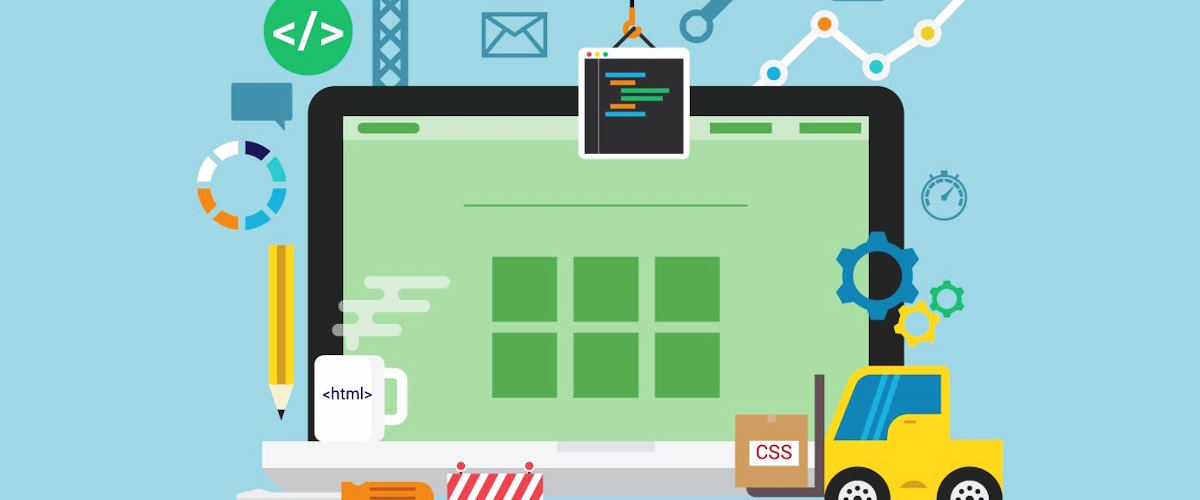
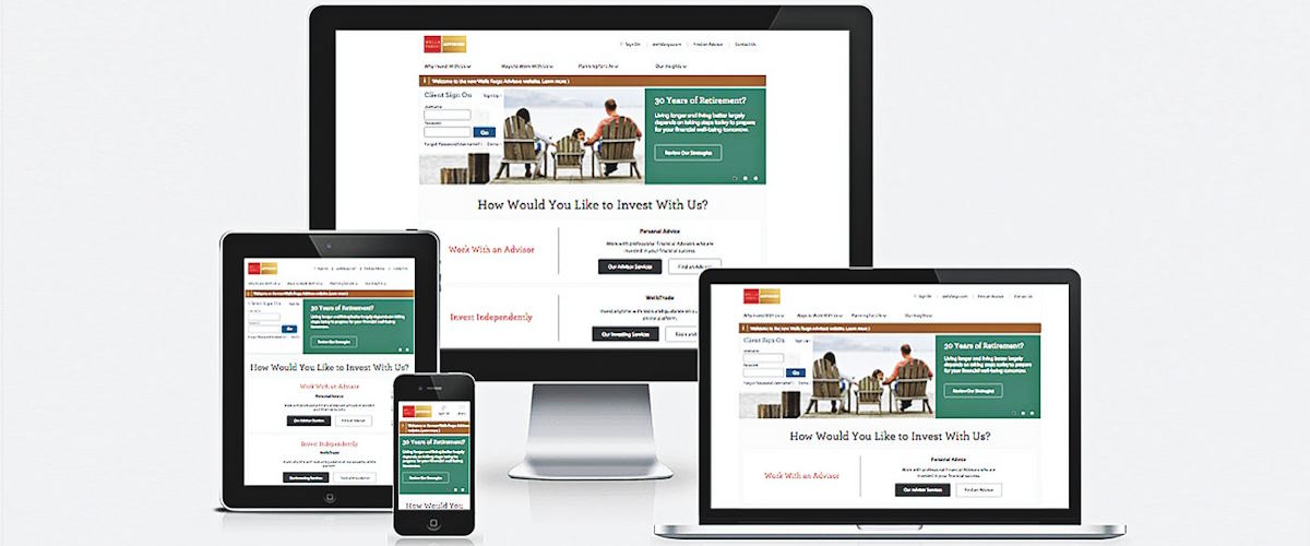
Many experienced website designers use world-class tools for building responsive websites. They make certain that responsive website design is vital to ensure that the website looks good on every device.
You may be a beginner at responsive website builder platforms, so think about how to choose a suitable one. The three main tools for responsive web design come into three main categories namely responsive templates, responsive design process, and responsive testing tools.
Gator Website Builder
Gator Website Builder includes more than 100 responsive website templates. You can choose the suitable one for an adaptive design. Every user of this tool includes a library of templates and an intuitive website builder. They feel comfortable because the user-friendly nature of this tool lets them customize the template and create a fully responsive website.
Simbla
Simbla includes 100 simple responsive website templates. You can use this tool to start your web design process without any complexity. Once you have decided to build a basic website with some pages, you can use this tool. You will get the most expected assistance to make a straightforward and responsive website.
Colorlib
Colorlib is an outstanding resource particularly designed to collect and highlight themes. All users of the popular WordPress can use this tool and get the most expected website design. Blog posts on this platform collect responsive themes and templates. You can use these options for building your website and save money while learning basic website design skills.
ThemeForest
Are you searching for the best frameworks for mobile-friendly websites? ThemeForest includes approximately 45,000 themes and templates. It is designed to assist WordPress users to easily build a website. You can focus on the basics of affordable themes and read reviews and ratings of these themes from past customers. You can get enough insights into how these things work.
Templated
Templated is known for its 900 responsive HTML templates freely accessible under the Creative Commons. Every user of this tool can conveniently browse their collection and download and use the approximate template without complexity in any aspect. Beginners to the website design can choose this tool and make an informed decision to create a responsive website design.
Bootstrap
Have you decided to use one of the best tools for creating adaptive web layouts on time? Bootstrap is an open-source and free tool designed for building mobile-first and responsive websites. It includes a toolkit of different elements you require to build a responsive website. It lets its users select the elements they need on their page to make prototyping intuitive.